PROJECT
Improving the User Experience at UNLV
A Case Study of UX Research on the User Experience of Campus Safety with UNLV’s RebelSAFE Mobile App

Introduction
At the University of Nevada Las Vegas (UNLV), they have a safety app called RebelSAFE. However, many students do not actually use this app for various design issues and functionality. My UX research group and I conducted a case study of why the safety app is not used by many students and developed a potential redesign of the app to increase usage and trust among students and staff.
My Role
As an undergraduate UX Researcher my responsibilities were to develop and redesign the RebelSAFE app, collaborate in creating a Design System that better fit the needs for users, and conducted usability testing with analysis to understand campus safety standards and student expectations at UNLV.
Accomplishments
Our research has been featured at HCII 2022 Short Paper and Poster Presentations
We presented at UNLV’s undergraduate research symposiums for both Fall 2020 and Spring 2021 Semesters
I assisted in leading usability tests with undergraduate students at UNLV
I contributed in shaping a coherent Design System for the RebelSAFE app that users trusted more than the original design

Project Overview
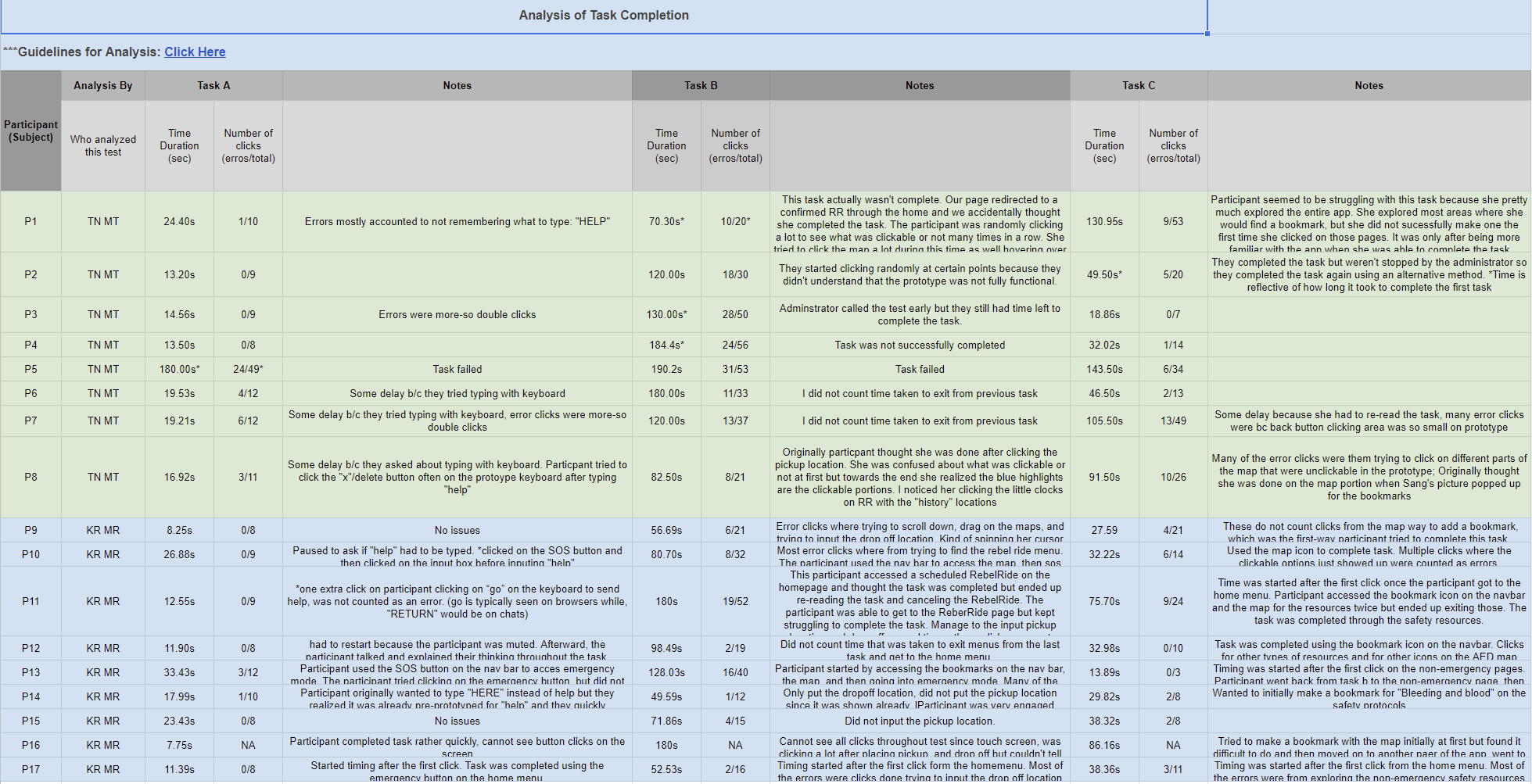
This study aimed to evaluate the visual design and usability of the University of Nevada, Las Vegas’s (UNLV) campus safety app, RebelSAFE. We found that campus safety at UNLV continues to be an issue among students, however, students have found the application to be unreliable. The study further evaluated the redesign using user testing to examine the overall effectiveness of this new visual hierarchy. This procedure included developing three (3) user tasks that allow users to navigate through the app highlighting our proposed features, marking successful completion within a three (3) minute time frame.
The Challenge of RebelSAFE
My team and I examined RebelSAFE and its features, hierarchy/layout, and functionality and dissected the user flow to get to key features such as calling emergency services or scheduling a “RebelRide” (a student ride-share service to get around campus). We identified key features we wanted to change in a redesign to make navigation less stressful on a user.

We developed user questions to ask to keep in mind as we go through design iterations when we redesign RebelSAFE. These questions included:
How can we contact UNLV police when we see suspicious activity?
Why would a user use the RebelApp to call the police versus calling them regularly on their phones?
Am I able to talk to a dispatch through text in a timely manner if I am unable to call?
How can I find a Rebel Ride near me?
Why do I need to call a number to request information about Rebel Rides?
How will I know when the next Rebel Ride is coming?
If this is an on-campus transportation, where can I access a Rebel Ride schedule?
Can I access the availability on the Rebel App? First Come, First Serve?

Forming the Tasks
Our team developed 3 user tasks that we would design and develop into prototypes for our usability test. These tasks focused on features we wanted users to be aware of such as notifying campus police, using campus ridesharing, and navigating to quick references.

The tasks are as follows:
Task A) You are in danger on campus and there is no one around you. You need to reach out to the campus police. However, it may be difficult to speak on the phone right now because you are trying to stay hidden. Using the RebelSafe mobile app, try to contact the UNLV police and type out ‘HELP’ to inform them you’re in danger.
Task B) You had to stay late on campus due to your schoolwork. You are trying to get to the parking garage but you are afraid to walk there by yourself. Using the RebelSafe mobile app, try to request/schedule a Rebel ride
Task C) You want to find what campus safety resources are available and where those are located. Using the RebelSafe mobile app, try to find all safety resources. And bookmark the most valuable resources for your future reference.
While developing our redesign, we wanted to focus on specific services such as emergency services, safeguard services, and police services. We highlighted an information architecture on where to navigate these specific features. We wanted all features to be accessible from the home page.
Prototypes and Design Systems
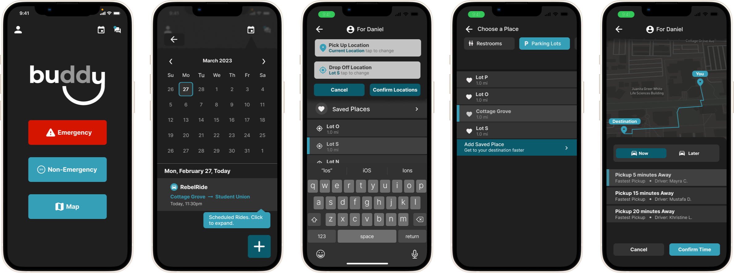
These low fidelity frames helped our group place the layout of the screens and possible components we can add onto the design system. These pages represent the basis of screens for each task such as the home page and the ride map. In comparison to the original RebelSAFE, we opted for a map-centric design as one of the main purposes for this app is to track a student’s location in a state of emergency.
We mapped out the user journeys created from the user flow charts to create these low fidelity prototypes. What my task was in the group was developing the RebelRide services (Task B). These screenshots show the menu on how to get to the service and the related screens for scheduling a service.
The Challenges
Figuring out a way students understand how to get to these services
Deciding what is the most simple method to schedule a ride share service
Consideration of combining features such as RebelRide or Friend Walk to simplify the overall model

The Low Fidelity Prototype
Putting it altogether: The Design System
We wanted to create a sense of consistency with the app when it came to components, typography, color, etc. and use these design patterns as we create mockups for our redesign. While making the design, it was difficult keeping track of all the components everyone on the team already created and gathering artifacts to create a coherent design system. The most important components we did need were modals, buttons, and dropdowns to easily update users on what is happening in the app.

Major Design Decisions
The typeface Inter provided the most readability out of other typefaces
Red was exclusive to emergency services and used sparingly throughout the design in order to alleviate stress on users
Yellow was exclusive towards non-emergency features to bring attention and highlight important features but are at most secondary to the overall experience
Opted to overall darken the app color palette to provide discreteness if a student is using the app while actively in danger
The High Fidelity Prototype
The high fidelity prototype followed the happy paths of the tasks detailed in the usability test. Once again options, were divided into tasks to be completed in the usability testing.
In Task A, users would be instructed to navigate through the prototype and try to navigate through the “Chat with Dispatch” feature. Participants were given a situation that they were on campus at night and unable to speak on the phone. Successful completion for Task A would be to type “Help” with the keyboard and display the dispatch tracking message.
In Task B, users would be instructed to schedule a Rebel Ride (campus rideshare). This involved setting up a designated pick-up location, drop-off location, and time for users to interact with to confirm the ride. Successful completion of this task would involve the participant receiving the ‘confirmed’ popup after scheduling the time.
In Task C, users would be instructed to identify useful features they would like to save for future reference and create a bookmark. There were three ways a user would be able to create a bookmark: through the map, through the bookmarks bar on navigation, or through the safety protocols within the resources tab. Successful completion would involve being able to create a bookmark in any of these areas and would indicate via pop-up (map and navigation bar) or icon change (safety protocols).

We were confident that our initial design was straightforward. Looking at how other apps such as Uber or Lyft schedule rides, it made sense to us designers and we thought that all tasks were simple to complete. Little did we know that it became the other way around.
First Usability Test and Analysis
We found that of our participants, 81.3% did not use the RebelSafe app. The reasoning behind why participants did not use the app included its ineffective app design, poor service quality, and finding no use for the services. Meanwhile, 56.3% of participants rated campus safety as a 2 out of 5, 25% rated safety as a 3 out of 5, and 18.75% rated it as a 4 out of 5. In addition, 12.5% rated the GRA and HFA building security at a 1 out of 5, 37.5% rated security at a 2 out of 5, 25% rated it at a 3 out of 5, and 25% rated it at a 4 out of 5.
While conducting the usability testing online, it was an experience seeing how people think when it comes to navigating through a new app. What we thought would be easy paths to take, many individuals struggled to make it through the correct ending point. It made me realize that I can’t always assume what the user is thinking and need to reconsider the hierarchy of the contents of what is on the page.
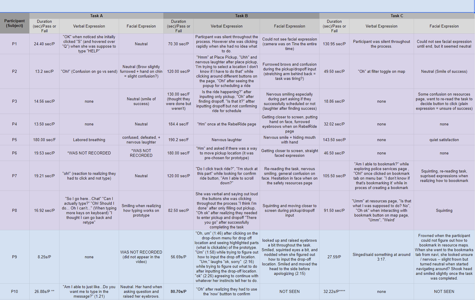
Furthermore, during the performance of each task, specific behaviors in participants such as visual or audible frustration/confusion were observed and recorded, alongside any part of the tasks that participants struggled with. In Task B, about 93% of users expressed confusion and nervousness such as squinting, moving closer to their screens, and/or verbally asking questions. In Task C, roughly 25% of users expressed confusion or nervousness.
From the data collected, it was shown that many people struggled with completing the Rebel Ride portion. Because that was the task I worked on the most, I really had to rethink and conduct more research in how the user journey should be when scheduling a ride. I felt worried because it was my design that needed the most rework. Scheduling a RebelRide was already complicated enough, it was clear that the process in scheduling a ride must be instinctual and focus on clearing up ambiguity when setting up a time for pick up.

Back to the Drawing Board
Following the analysis of the usability test, it has been clear that the most difficult task was the rideshare scheduling. What confused people the most was what step came next meaning, when picking the location, how should a user confirm the time. In this redesign, it became clear to us that in order for this feature to work, the flow needed to be more straightforward. As a result, this lead to a complete redesign focusing on a new user flow a whole new design system. The key for this redesign was simplicity.
Rethinking the Userflow and Design System
Some major changes of the design system and the flow included changing the color palette to be more muted in order to prioritize function. Within the flow the team decided to reserve Non-Emergency for 3-1-1 calling and chatting, add a map feature to include other services, add a calendar view to show schedule services, and we got rid of bookmarking and navbar. The new design system focused on giving more clear elements on scheduling rideshares where the team looked at similar rideshare apps such as Uber, Waze, and Lyft as inspiration.


Dividing the functions in the app between emergency and non-emergency worked in our favor in terms of presenting an overall hierarchy. It was a matter of cutting down the overall features in the app to make it more appealing to students. Referring back to the original design, students did not trust the app because it lacked a visual structure. By thinking about the information architecture, we were able to identify what is really necessary in this safety app.
The new design system was inherently different from the old design. In a way, we figured it was best to start fresh and rethink a utilitarian approach on the visuals. While we wanted to maintain an ease of use overall, the app needed to mature and reach familiarity to students. This meant to see what design patterns existing apps have and how we can modify it to our design system. Icons, banners, modals needed to be more clear and show up in appropriate times for the student experience.

High Fidelity and the New Tasks
This new design and preparation of another usability test for RebelSAFE focused on enhancing the experience when it came to scheduling a “Rebel Ride.” What went wrong on my previous design was that users had a difficult time confirming the ride because they could not locate the scheduling time option. This new iteration automatically takes a user step by step in the process so users do not have to go searching for the schedule.
Don’t Make Me Think!
Scheduling a ride should not make the user feel frustrated or not confident in the feature. Now, a user can schedule a ride immediately (Task A), for a later time (Task B), or have reoccuring ride schedules (Task C).
A new aspect of RebelSAFE was the new rebrand to “Buddy” marketing as a general safety app other universities may want to adopt in order to promote improved campus safety measures. The meaning behind “Buddy” was to show that as a student you in safe hands such as walking with a friend / buddy on campus.
Final Usability Testing Results
Participants had a greater understanding of the User Flow and a more streamlined user journey. Task A was to schedule a RebelRide immediately. Task B was to schedule a RebelRide later with one occurrence. Task C was to schedule a RebelRide later with multiple occurences.
Task A had the highest completion rate with 100%. Both Task B and Task C had a 83.3% completion rate. We found that participants felt more inclined to use the redesigned app because of its straightforward hierarchy and organization, as well as its use of less overwhelming colors.


Conclusion
100% of participants preferred the redesigned application interface. Most noted they would consider using RebelSAFE more if it had this improved design. Others noted it would be useful to integrate the app with other, general campus news.
We aimed to conduct a second redesign of the app that addressed concerns and improvements brought up by users.
A second round of usability tests would then be conducted with the same participants from our first round of usability tests for A&B comparison.
We hope that our findings can serve beneficial for the improving safety app designs at other schools.